In Person
We are located on the 1st floor. Down the hall from the Starbucks!
By Phone
Need help finding information? Call us:
610.436.3395
By Email
Email your questions to:
PowerPoint and Publisher are your friends when designing a large-format poster. This is because you are likely already familiar with the tools in other Microsoft Products here on campus. See the tabs at the top of this page for design instructions using each of these programs.
DO NOT USE MS WORD - the maximum size that can be printed from a Word file does not work for poster printing.
If you use one of these templates, and there are objects you cannot click on and delete, right click on the slide and choose Format Background > Hide Background Graphics to try to remove these objects.
Images - When working with images such as the school logo, students often grab something from a website. Most graphics on websites are not designed for print. This causes the graphic to be pixelated when printed. If you do use an image you don't own get permission before using it and don't forget to cite it in your references!
Layout - Most posters should have a flow to them, especially if they are academic in nature. An introductory section should not be immediately followed by a conclusion section, etc. Also try to make sure sections of the poster are not "running together" and that each section is clearly labeled with its own space.
Fonts - Many times we see the mistake of a student switching fonts halfway through a paragraph. Highlight the word and look at the drop down menu to see what font you used. Then make sure when you start a new paragraph/section that you use the same font.
Colors - Bad color combinations can ruin good content. Avoid bright jarring colors. Try to limit your colors to 2 or 3 colors.
Give credit - Anything you don't own or didn't create must have the source cited in your references.
Our best piece of advice is to go to Swarthmore College Professor, Colin Purrinton's webpage called Designing Conference Posters. He says it all in a witty and memorable way. Then come back to this guide when you are ready to start making your poster on the computer.
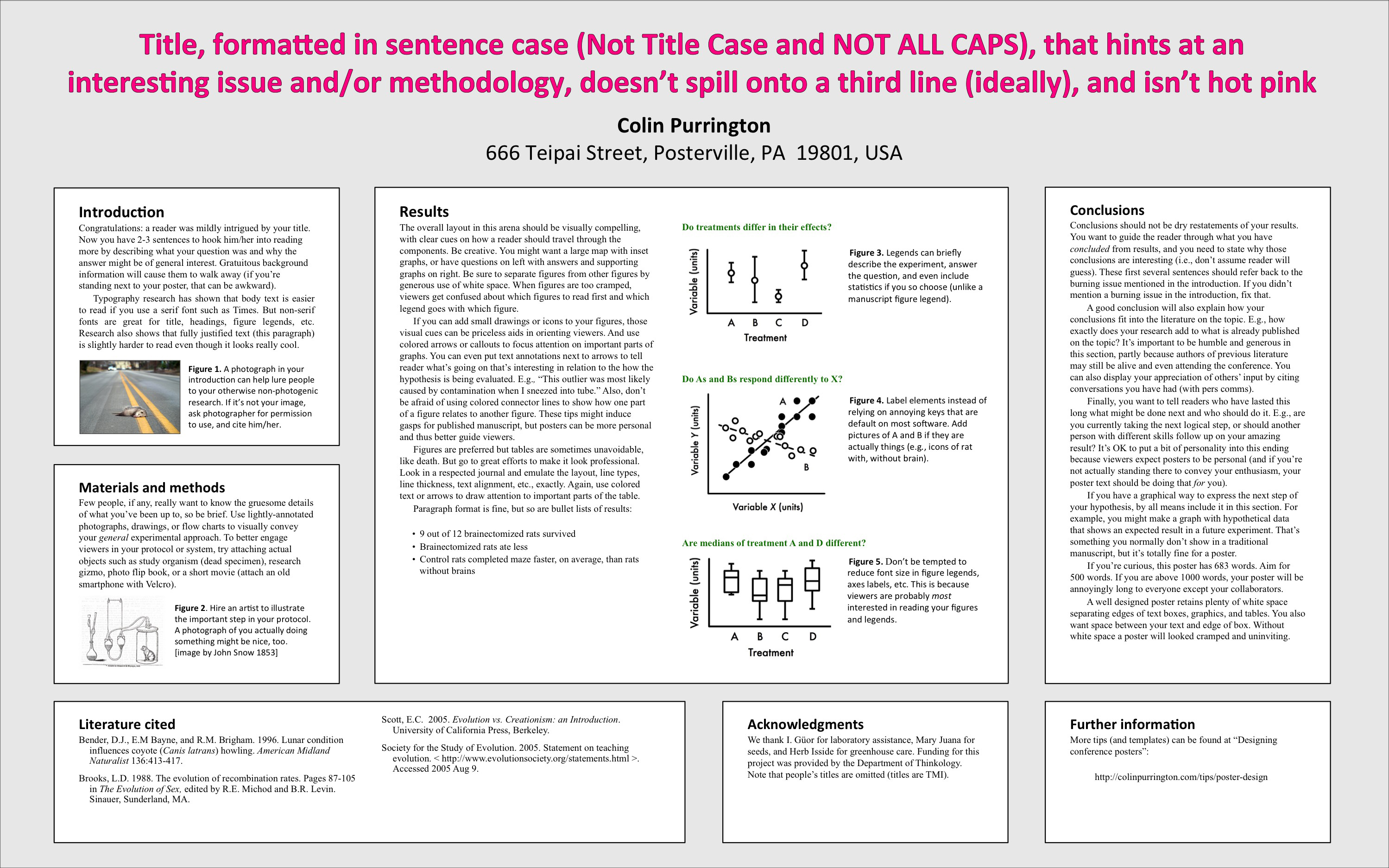
This is a "best practices" example.
If you click on the poster below you can see a larger version. (used with permission from Colin Purrington's website )
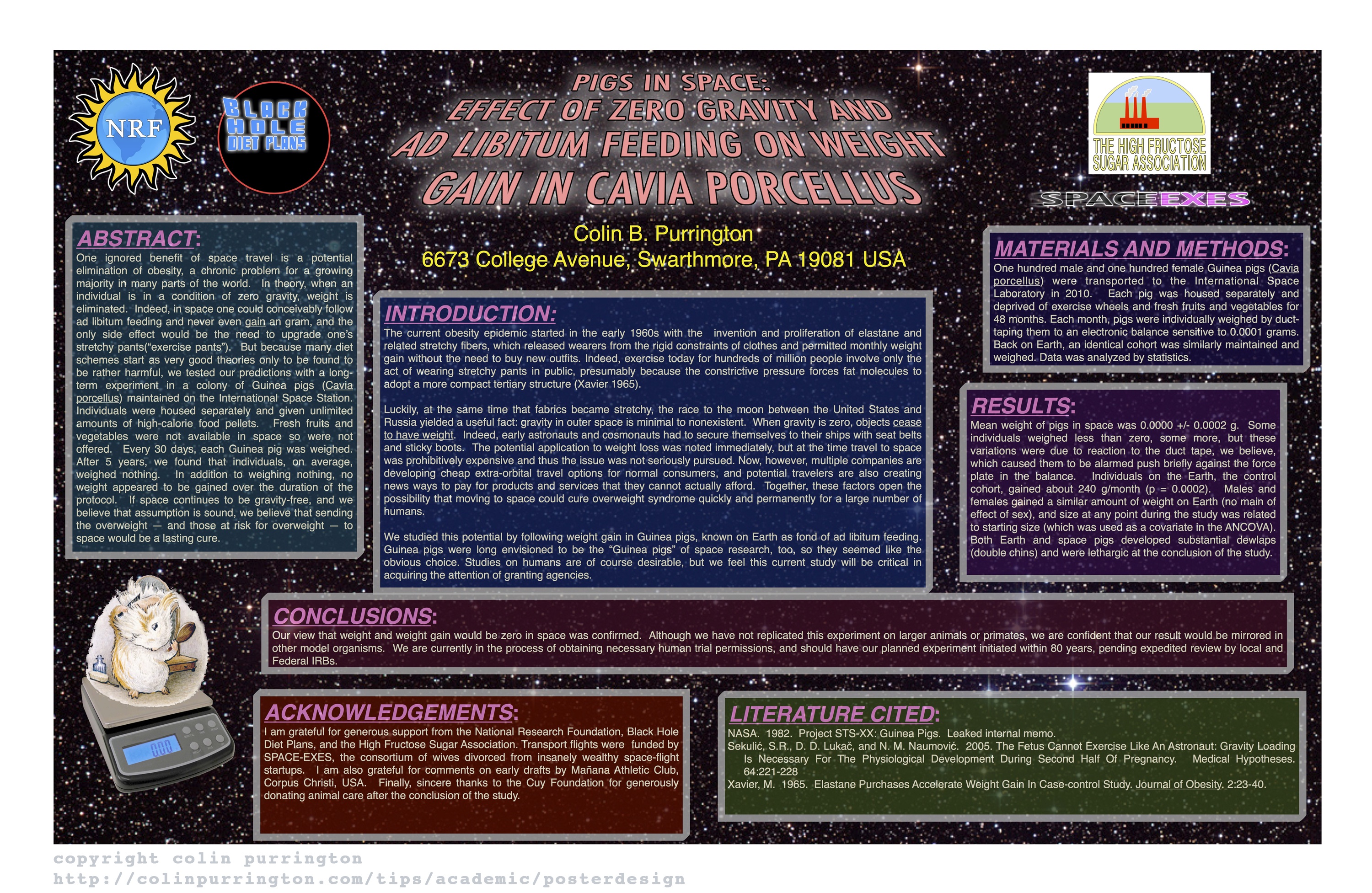
Below is an example of What Not to do...
If you click on the poster below you can see a larger version. (used with permission from Colin Purrington's website )